Single Plot Charts with Chartly Examples
Line Plot
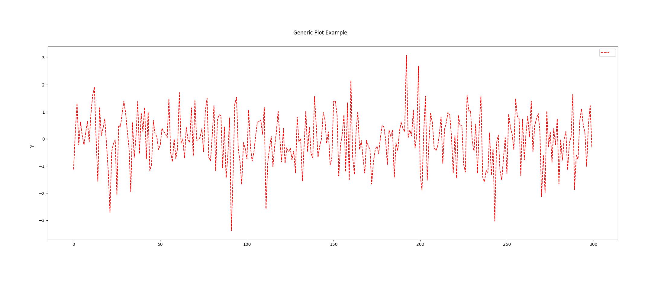
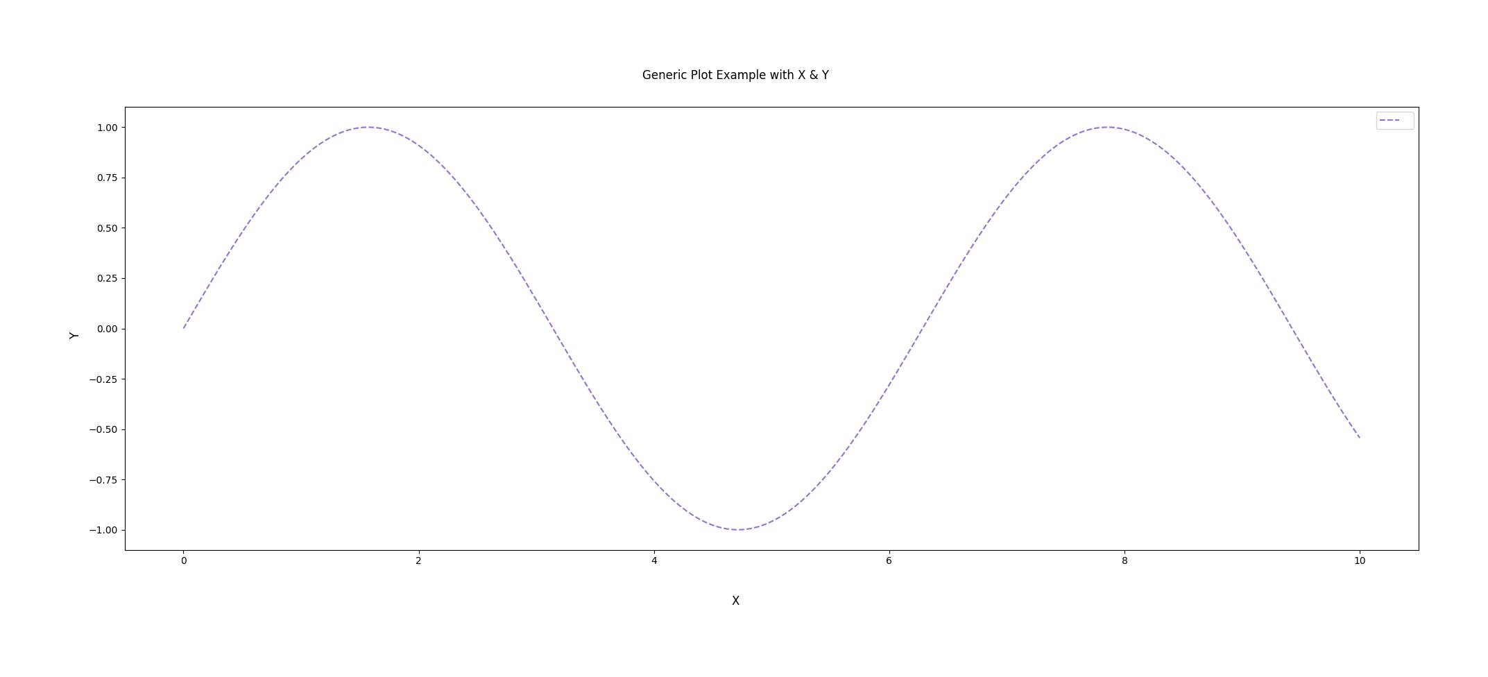
A line plot can be created by using the line_plot keyword. Users can pass both x and y data or just y data to the line plot.
The following customization options are available for the Line Plot:
color (str): The color of the line.
linestyle (str): The style of the line.
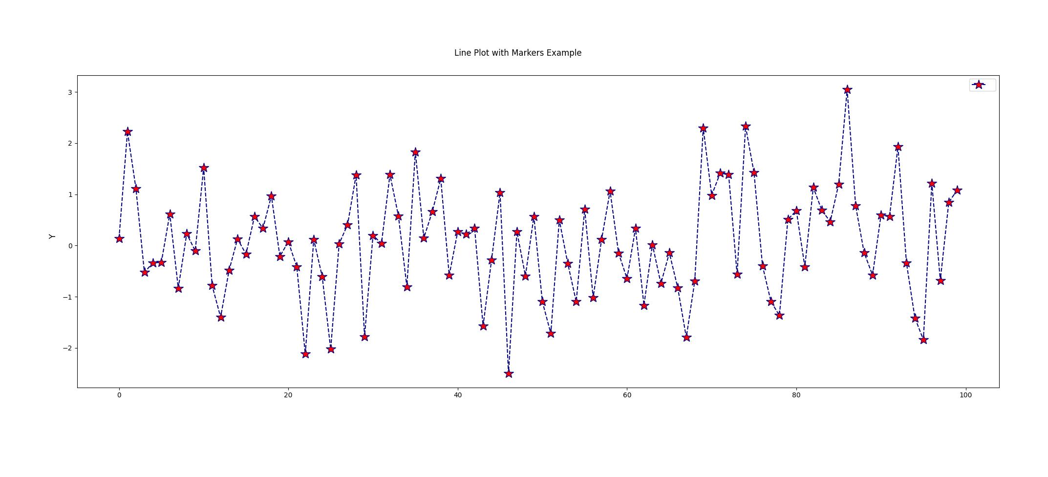
marker (str): The style of the markers.
markersize (int): The size of the markers.
markercolor (str): The color of the markers.
markeredgecolor (str): The edge color of the markers.
import chartly
import numpy as np

# Only y data
data = np.random.randn(300)

# customize the plot
customs = {"color": "red", "linestyle": "--"}

# label the plot
super_axes_labels = {"super_ylabel": "Y", "super_title": "Generic Plot Example"}

# create a chart instance
plot = chartly.Chart(super_axes_labels)

# Set the arguments for the plot
plot_payload = {
    "plot": "line_plot",
    "data": data,
    "customs": customs,
}

# Create a subplot and plot the data
plot.new_subplot(plot_payload)

# Build and display the main figure
plot()
import chartly
import numpy as np

# x and y data
x = np.linspace(0, 10, 100)
y = np.sin(x)

# define plot labels
super_axes_labels = {
    "super_ylabel": "Y",
    "super_xlabel": "X",
    "super_title": "Generic Plot Example with X & Y",
}

# create a chart instance
plot = chartly.Chart(super_axes_labels)

# customize the plot
customs = {"color": "mediumpurple", "linestyle": "--"}

# set the arguments
plot_payload = {"plot": "line_plot", "data": [x, y], "customs": customs}

# Create a subplot and plot the data
plot.new_subplot(plot_payload)

# Build and display the main figure
plot()
import chartly
import numpy as np

# define data
data = np.random.randn(100)

# customize the plot
customs = {"color": "navy", "linestyle": "--", "marker": "*", "markercolor": "red", "markersize": 15}

# label the plot
super_axes_labels = {"super_ylabel": "Y", "super_title": "Line Plot with Markers Example"}

# create a chart instance
plot = chartly.Chart(super_axes_labels)

# set the arguments
plot_payload = {
    "plot": "line_plot",
    "data": data,
    "customs": customs,
}

plot.new_subplot(plot_payload)

plot()
Scatter Plot
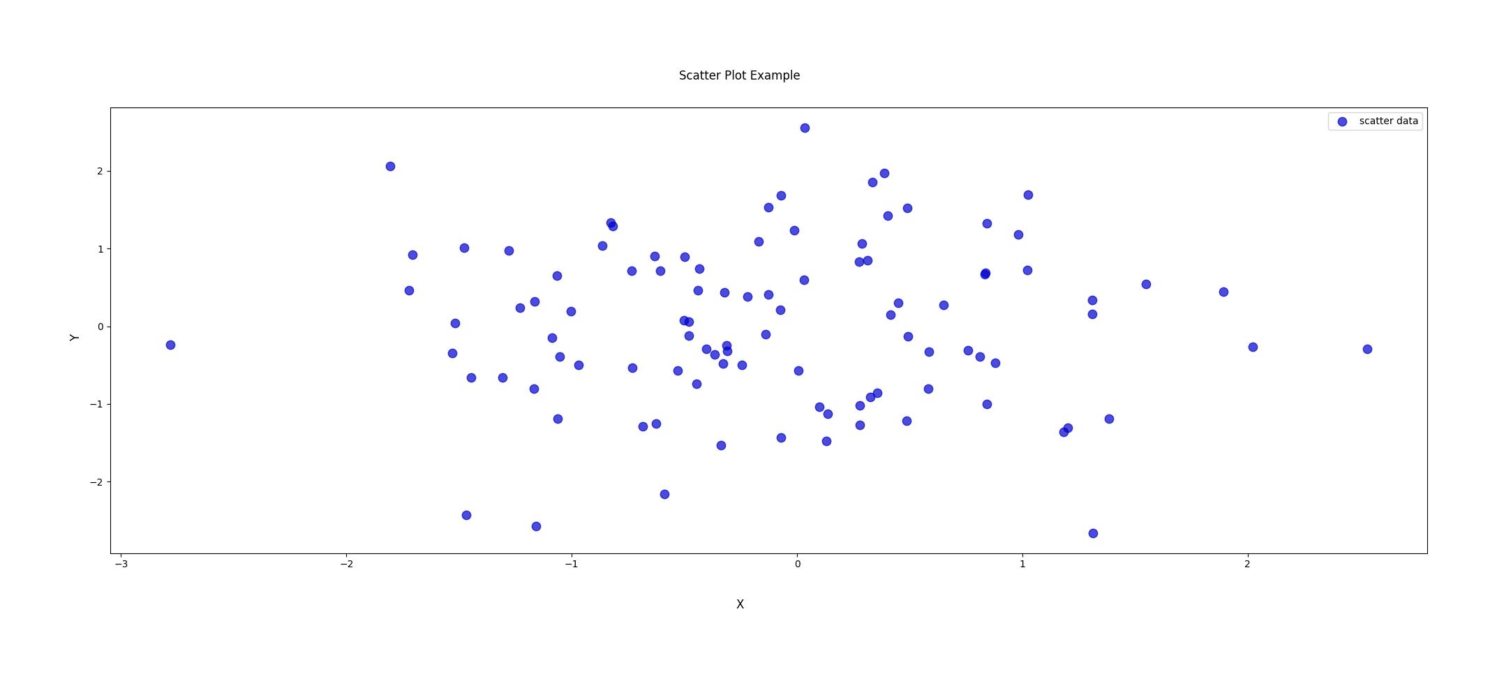
A scatter plot can be created using the scatter keyword. The following customization options are available for the scatter plot:
color (str): The color of the markers.
marker (str): The style of the markers.
size (int): The size of the markers.
alpha (float): The transparency of the markers.
label (str): The label of the markers.
import chartly
import numpy as np

x = np.random.randn(100)
y = np.random.randn(100)

# label the plot
super_axes_labels = {
    "super_ylabel": "Y",
    "super_xlabel": "X",
    "super_title": "Scatter Plot Example",
}

# create a chart instance
plot = chartly.Chart(super_axes_labels)

# customize the plot
customs = {"color": "blue", "marker": "o", "size": 50, "alpha": 0.5, "label": "data"}

# set the arguments
plot_payload = {"plot": "scatter", "data": [x, y], "customs": customs}

# Create a subplot and plot the data
plot.new_subplot(plot_payload)

# Build and display the main figure
plot()
Histogram
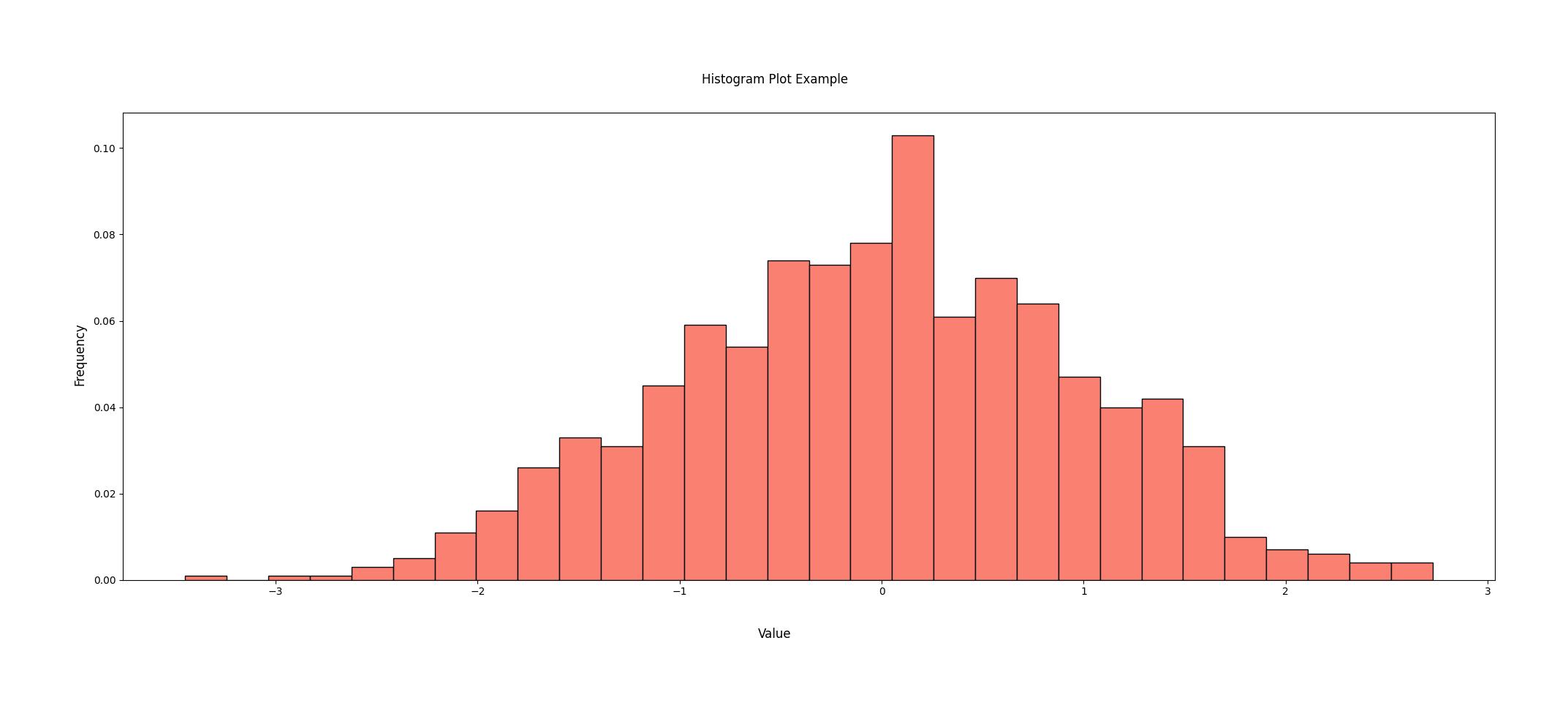
A histogram plot can be created using the histogram keyword. The histogram plot requires a 1D array of data to be passed to the plot. The following customization options are available for the histogram plot:
color (str): The color of the histogram.
num_bins (int): The number of bins in the histogram.
ran (tuple): The range of the histogram.
import chartly
import numpy as np

data = np.random.randn(1000)

# label the plot
super_axes_labels = {
    "super_ylabel": "Frequency",
    "super_xlabel": "Value",
    "super_title": "Histogram Plot Example",
}

plot = chartly.Chart(super_axes_labels)

# customize the plot
customs = {"color": "salmon", "num_bins": 30}

# set the arguments
plot_payload = {"plot": "histogram", "data": data, "customs": customs}

# Create a subplot and plot the data
plot.new_subplot(plot_payload)

# Build and display the main figure
plot()
Contour Plot
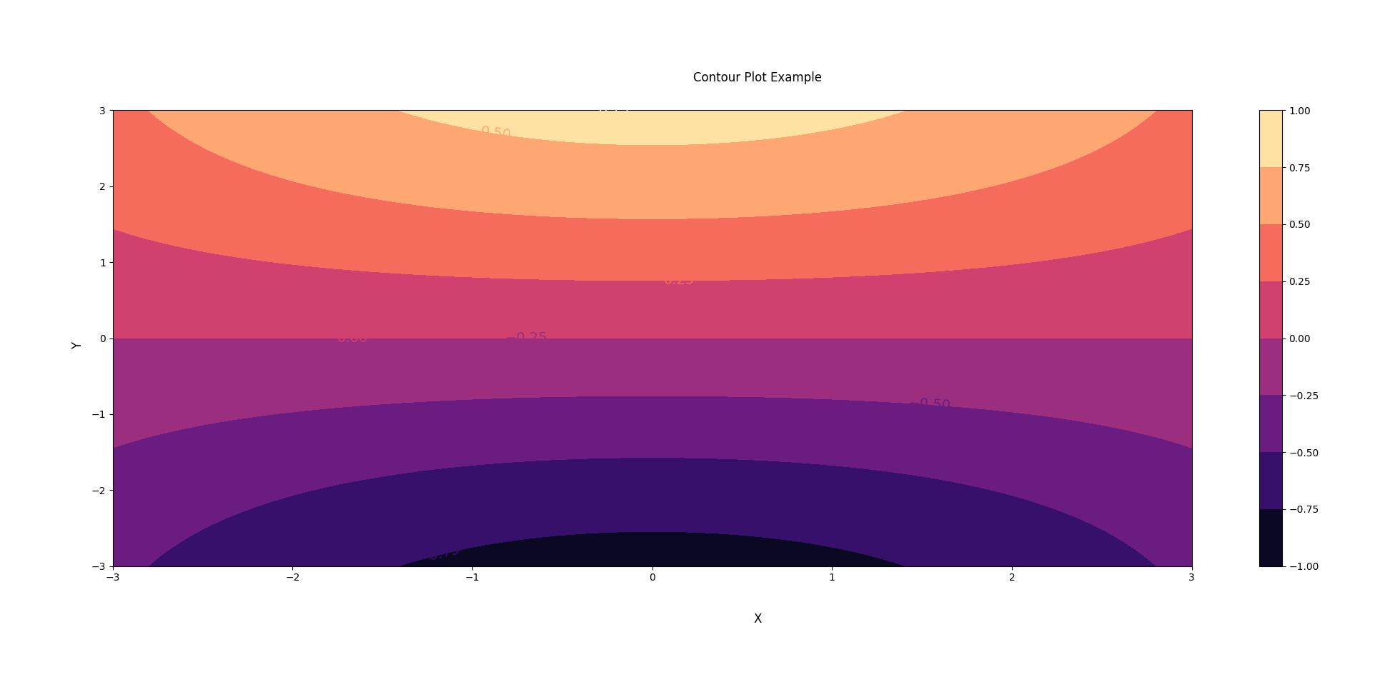
Contour plots can be created using the contour keyword. The contour plot requires 2D arrays of X, Y and Z data to be passed to the plot. The following customization options are available for the contour plot:
inline? (bool): Whether the contour labels are inline or not.
color (str): The color of the contour plot. Ensure that the cmap is set to None.
levels (int): The number of contour levels.
colormap (str): The colormap of the contour plot.
filled? (bool): Whether the contour plot is filled or not.
fontsize (int): The font size of the contour labels.
hatch? (bool): Whether the contour plot has a hatched area or not.
hatch_customs (dict): The hatch customization options.
 import chartly
 import numpy as np

 x = np.linspace(-3.0, 3.0, 100)
 y = np.linspace(-3.0, 3.0, 100)
 X, Y = np.meshgrid(x, y)
 Z = np.cos(X/3) * np.sin(Y/3)

 # label the plot
 super_axes_labels = {
     "super_xlabel": "X",
     "super_ylabel": "Y",
     "super_title": "Contour Plot Example",
}

 # Create a charts instance
 plot = chartly.Chart(super_axes_labels)

 # customize the plot
 customs = {"colormap": "magma", "fontsize": 14, "filled?": True}

 # set the arguments
 plot_payload = {"plot": "contour", "data": [X, Y, Z], "customs": customs}

 # Create a subplot and plot the data
 plot.new_subplot(plot_payload)

 # Build and display the main figure
 plot()
Normal Probability Plot
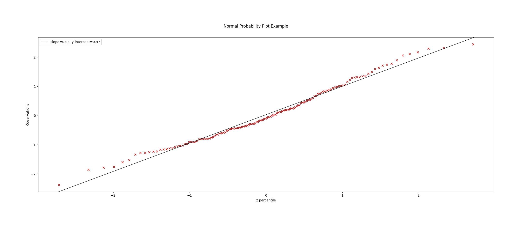
The normal probability plot is used to determine if a dataset is approximately normally distributed. A normal probability plot can be created using the probability_plot keyword. The normal probability plot requires a 1D array of data to be passed to the plot. The following customization options are available for the normal probability plot:
color (str): The color of the markers of the plot.
import chartly
import numpy as np

data = np.random.randn(150)

# label the plot
super_axes_labels = {"super_title": "Normal Probability Plot Example"}

# create a chart instance
plot = chartly.Chart(super_axes_labels)

# customize the plot
customs = {"color": "firebrick"}

# set the arguments
args = {"plot": "probability_plot", "data": data, "customs": customs}

# Create a subplot and plot the data
plot.new_subplot(args)

# build and display the main figure
plot()
Cumulative Distribution Function Plot
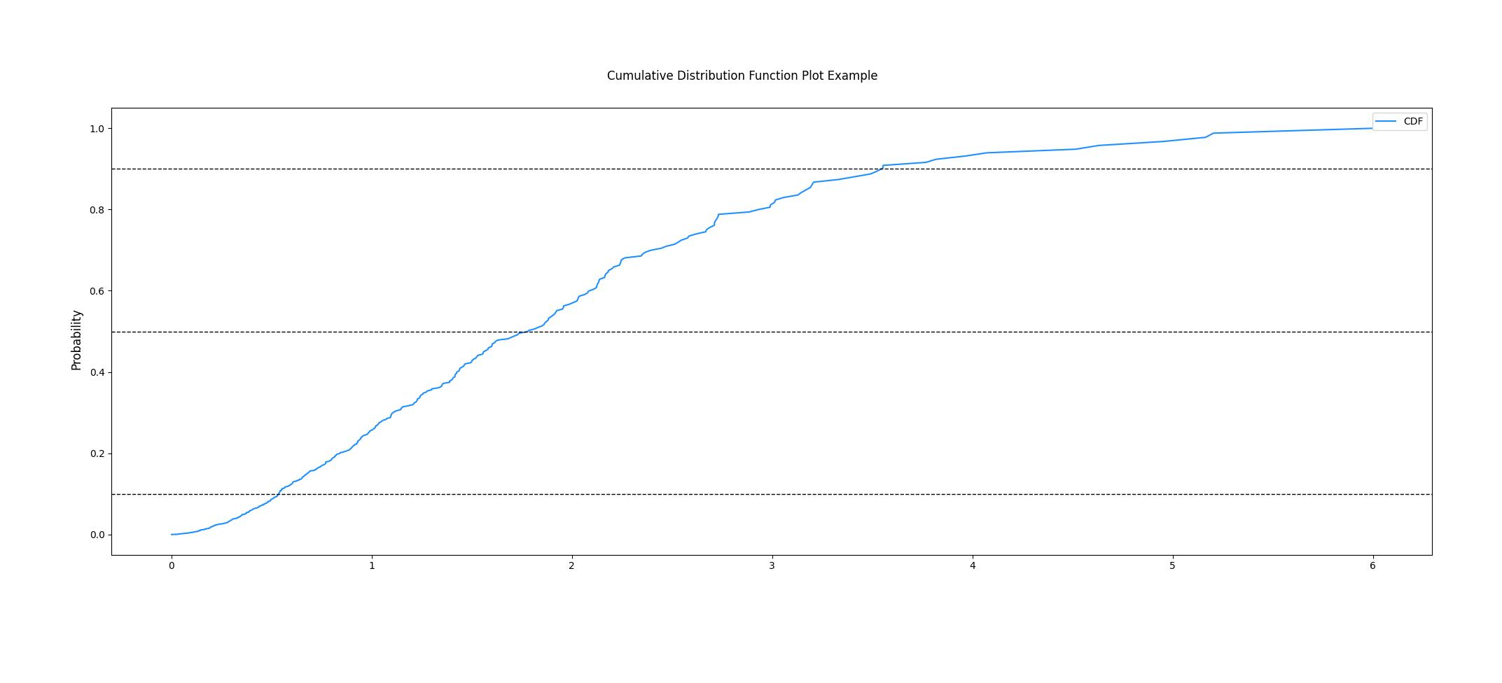
The CDF plot of a dataset can be created using the cdf keyword. The CDF plot requires a 1D array of data to be passed to the plot. The following customization options are available for the CDF plot:
color (str): The color of the CDF plot.
import chartly
import numpy as np

data = np.random.exponential(scale=1.0, size=500)

# label the main figure
super_axes_labels = {
    "super_title": "Cumulative Distribution Function Plot Example",
    "super_ylabel": "Probability",
}

# Create a chart instance
plot = chartly.Chart(super_axes_labels)

# customize the plot
axes_labels = {"linelabel": "CDF"}
args = {"plot":"cdf", "data": data, "axes_labels": axes_labels}

# Create a subplot and plot the data
plot.new_subplot(args)

# Build and display the main figure
plot()
Normal Cumulative Distribution Function Plot
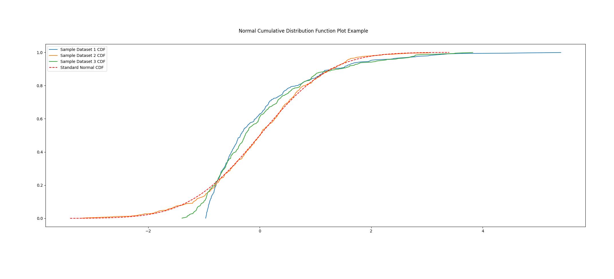
The CDF of a dataset can be compared to the CDF of a normal distribution using the normal CDF plot. The normal CDF plot can be created using the normal_cdf keyword. Users can pass multiple datasets to the plot.
import chartly
import numpy as np

dataset_one = np.random.exponential(scale=1.0, size=500)
dataset_two = np.random.normal(loc=2, scale=1, size=500)
dataset_three = np.random.gamma(2, 2, 500)
data = [dataset_one, dataset_two, dataset_three]

# label the main figure
super_axes_labels = {"super_title": "Normal Cumulative Distribution Function Plot Example"}

# create a chart instance
plot = chartly.Chart(super_axes_labels)

# set the arguments
args = {"plot": "normal_cdf", "data": data}

# Create a subplot and plot the data
plot.new_subplot(args)

# Build and display the main figure
plot()
Density Plot
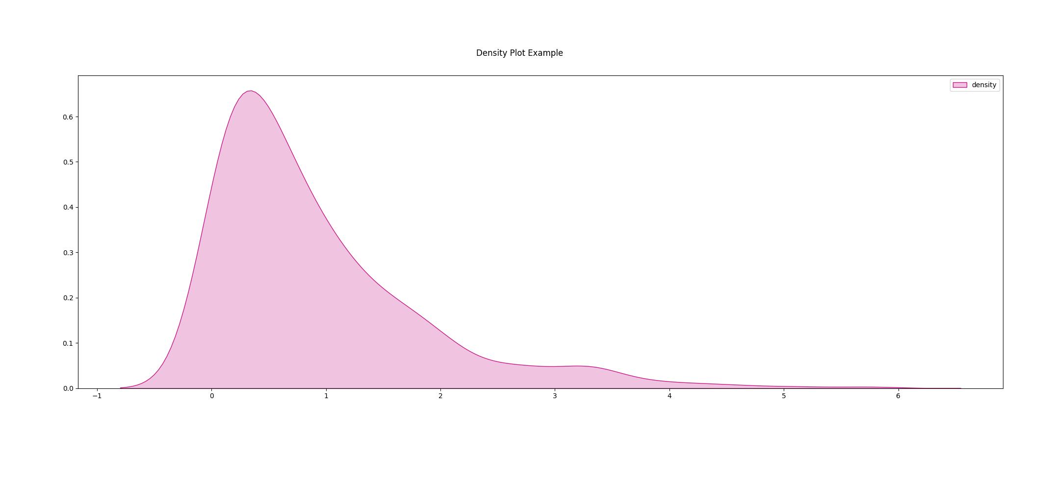
The density function of a distribution can be created using the density keyword. The density plot requires a 1D array of data to be passed to the plot. The following customization options are available for the density plot:
color (str): The color of the density plot.
fill (bool): Whether the density plot is filled or not.
import chartly
import numpy as np

data = np.random.exponential(scale=1.0, size=500)

# label the plot
super_axes_labels = {"super_title": "Density Plot Example"}

# create a chart instance
plot = chartly.Chart(super_axes_labels)

# define the customs
customs = {"fill": True, "color": "mediumvioletred", "label": "density"}

# set the arguments
plot_payload = {"plot": "density", "data": data, "customs": customs}

# Create the subplot and plot density plot
plot.new_subplot(plot_payload)

# Build and display the main figure
plot()
Box Plot
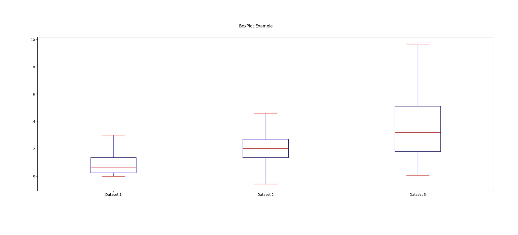
A boxplot of one or more datasets can be plotted using the BoxPlot class. A dataset list or a list of dataset lists can be passed to the BoxPlot plot. The following customization options are available for the BoxPlot plot:
showfliers (bool): Whether to show the outliers in the boxplot.
boxlabels (list): The labels of the boxplots.
import chartly
import numpy as np

dataset_one = np.random.exponential(scale=1.0, size=500)
dataset_two = np.random.normal(loc=2, scale=1, size=500)
dataset_three = np.random.gamma(2, 2, 500)
data = [dataset_one, dataset_two, dataset_three]

# label the main figure
super_axes_labels = {"super_title": "BoxPlot Example"}

# create a chart instance
plot = chartly.Chart(super_axes_labels)

# define the customs
customs = {"showfliers": False}

# set the arguments
plot_payload = {"plot": "boxplot", "data": data, "customs": customs}

# Create new subplot and plot the boxplot
plot.new_subplot(plot_payload)

# Build and display the main figure
plot()
